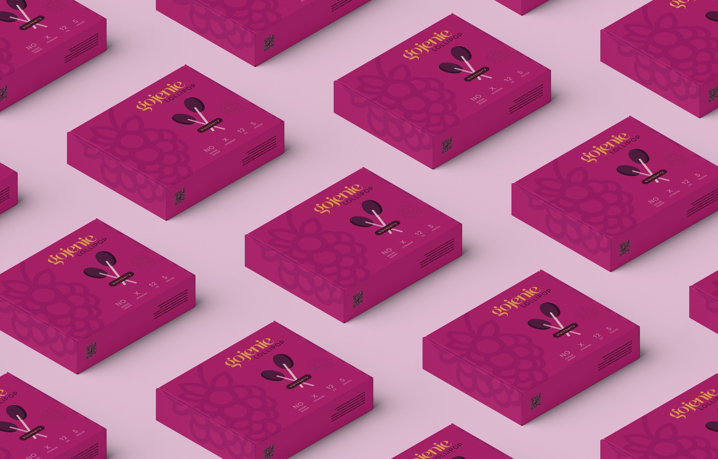
Gojenie
Gojenie is a startup that transforms the sweets you used to love as a child, but now hesitate to give your own children, into healthier versions with better ingredients and fruit extracts. When creating the brand identity, the primary goal was to develop an innovative, clean, and systematic design that appeals to conscious consumers while staying true to the fun world of sweets. The design of the first product, blackberry-infused lollipops, laid the foundation for the brand, with future product designs also taken into consideration.
What We Did?
Brand Strategy
Brand Identity
Packaging Design
Design Attributes
Gojenie, its natural ingredient sweets were developed taking inspiration from bees. That's why the 'g' in its logo represents a bee. The curves of the font used in the logo symbolize nature and earth.


